Introduction
Light and dark mode are now common across operating systems, applications and websites. Many users expect digital products to respond to their system preference or provide a manual theme toggle.
However, dark mode is not simply an aesthetic variation. It intersects with visual perception, accessibility standards, energy considerations, and design system architecture. This article examines dark mode from four perspectives: user experience, accessibility, technical implementation and cultural positioning.
Why Dark Mode Exists
Dark mode gained adoption for several reasons :
• Reduced perceived eye strain in low-light conditions
• Lower battery consumption on OLED displays
• Aesthetic preference
• System-level integration across operating systems
The introduction of the prefers-color-scheme media query enabled websites to detect device-level preferences and respond accordingly.
Yet widespread adoption does not automatically justify universal implementation. The design implications require closer examination.
How Our Eyes Actually Read
Reading performance is influenced by contrast polarity: dark text on light background (positive polarity) versus light text on dark background (negative polarity).
Empirical research indicates that positive polarity generally supports faster reading speed and improved comprehension for sustained reading tasks. This aligns with centuries of print convention.
Dark mode can reduce glare in dim environments. However, it does not inherently improve readability for long-form content. The effectiveness of a theme depends on environment, task duration and content density .
Accessibility and WCAG Requirements
Accessibility is a non-negotiable requirement.
WCAG 2.1 requires a minimum contrast ratio of 4.5:1 for normal body text and 3:1 for large text. Designers often reduce contrast in dark interfaces for aesthetic subtlety, unintentionally compromising readability.
Additionally, pure white text on pure black backgrounds can produce halation, a perceptual glow that reduces clarity. Effective dark interfaces use softened whites and slightly off-black backgrounds to balance legibility and comfort .
User Experience Decisions
Dark mode implementation involves strategic choices :
• Whether to detect system preference automatically
• Whether to provide a manual toggle
• Whether to persist user choice across sessions
Best practice combines system detection with manual override. User choice should be stored locally so that theme preference remains consistent between visits.
Technical Implementation Using Design Tokens
Dark mode does not require two separate versions of a website.
Instead, modern implementations use CSS variables, often referred to as design tokens. Rather than hard-coding colour values throughout the interface, semantic variables are defined:
• Background
• Primary text
• Surface
• Accent
The same variables are reassigned when the theme changes. JavaScript applies a data attribute such as data-theme=“dark” to the root HTML element, and CSS responds by swapping variable values.
This approach supports scalability, maintainability and consistency within larger systems .
Demonstration: Applying and Detecting Theme
Click here to access the demo site
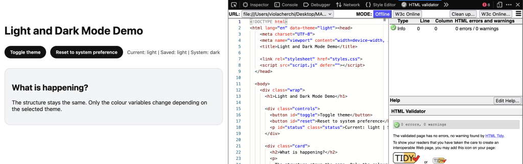
Figure 1. Theme application via data attribute on the root element.
In the demonstration, the theme is applied by assigning a data attribute to the root HTML element. CSS responds to this attribute by reassigning colour variables. The layout remains unchanged. Only semantic colour tokens are updated. This illustrates that dark mode is a structured variable swap rather than a visual inversion.
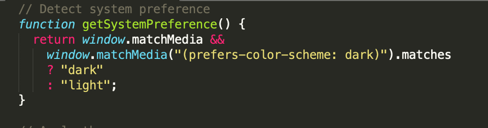
Figure 2. Using matchMedia to detect operating system colour preference.
The function above uses the matchMedia API to evaluate the prefers-color-scheme media query. If the operating system indicates a preference for dark mode, the function returns “dark”; otherwise it returns “light”. This enables websites to align with user-level settings without manual configuration.
Avoiding Theme Flicker in Production
If the theme is applied after the browser renders content, users may briefly see the incorrect theme before it switches. This flash of incorrect theme can reduce perceived quality .
In production environments, developers often include a minimal inline script in the head section to apply the correct theme before the first paint. This ensures that the correct colour scheme is rendered immediately.
Performance and Energy Considerations
Dark mode does not reduce loading time. Website performance remains dependent on file size, caching, rendering strategy and network efficiency .
On OLED displays, dark pixels consume less power because they are not illuminated. Therefore, battery savings are device-dependent rather than universally applicable.
Cultural Context: Dark Mode as Trend
Beyond technical considerations, dark mode has become culturally associated with “modern”, “developer-oriented” and “minimal” aesthetics.
As a result, some websites adopt dark mode as a visual signal of sophistication rather than as a usability improvement. This raises an important design question: is dark mode implemented to serve users, or to signal trend awareness?
A critical design approach requires distinguishing between genuine usability enhancement and aesthetic conformity. Ironically, dark mode can become another form of visual standardisation if adopted without contextual justification.
Common Mistakes
Common implementation errors include :
• Insufficient contrast
• Logos disappearing on dark backgrounds
• Form fields becoming unreadable
• Lack of accessibility testing
A poorly implemented dark mode can degrade usability more than not offering one at all.
When Not to Use Dark Mode
Dark mode is not universally appropriate .
Content-heavy academic sites may benefit more from positive polarity. Strong brand constraints may limit adaptability. Limited development time may result in incomplete implementation.
Design decisions should be contextual rather than trend-driven.
Conclusion
Dark mode is a contextual design decision rather than an automatic improvement.
It must prioritise accessibility, be implemented using structured design tokens, respect user preference, and be tested rigorously across themes.
When executed thoughtfully, dark mode enhances user control and experience. When implemented superficially, it risks reducing readability and reinforcing aesthetic conformity.
References
W3C. (2018). Web Content Accessibility Guidelines (WCAG) 2.1.
MDN Web Docs. prefers-color-scheme.
https://developer.mozilla.org/en-US/docs/Web/CSS/@media/prefers-color-scheme
MDN Web Docs. Window.matchMedia().
https://developer.mozilla.org/en-US/docs/Web/API/Window/matchMedia
MDN Web Docs. Web Storage API.
https://developer.mozilla.org/en-US/docs/Web/API/Web_Storage_API
Google Developers. (2020). Dark Mode in Web Content.
https://web.dev/articles/prefers-color-scheme
Nielsen Norman Group. (2020). Dark Mode vs. Light Mode: Which Is Better?
https://www.nngroup.com/articles/dark-mode/
Leave a Reply