Author: purple

  • Small Business Website – Revisited

    Part 1: Critical Analysis of the Original Website


    The original version of the Alf’s Cycles website was built during the Design for Web Content module as an introductory project. While it achieved a functional five-page structure with a consistent visual identity, reviewing it with the knowledge gained since then reveals several areas where the design, code quality and user experience fall short of contemporary best practice.


    Structure and Semantics

    The original site uses HTML5 semantic elements such as , , and , which provides a reasonable baseline. However, there are notable structural issues. The element is used for the site name “Alf’s Cycles” in the header of every page rather than for the page’s primary content heading. This means inner pages like “About” and “Bikes” lack a true content-level, which weakens both the semantic hierarchy and SEO signalling.

    Heading levels are inconsistent across pages. On the About page, sections such as “How we work” and “Why visit a local shop?” are marked up as elements, but they sit directly under a, with no intermediate content that would justify skipping to. On the Find Us page, there is a duplicate id attribute (“getting-here” appears twice), which is invalid HTML and could cause issues for both JavaScript and assistive technology.

    The homepage index.html has a structural nesting error: the “services-overview” section is never properly closed before the “visit” section begins, meaning the closing tags do not match the opening ones correctly. While browsers are forgiving of this, it represents invalid markup that a validator would flag.

    Accessibility

    Accessibility in the original site is minimal. The element has no aria-label, making it harder for screen reader users to identify the navigation’s purpose, particularly if the site were to have multiple navigation regions. There is no skip-to-content link, so keyboard users must tab through the entire header and navigation on every page before reaching the main content.
    Alt text is present on all images but is sometimes generic or contains a typo – the homepage uses “Bycicles on display” rather than “Bicycles on display”. The contact details on the Find Us page use plain text for the phone number and email address rather than clickable and links, which limits usability on mobile devices and for assistive technology users.
    There is no accessibility statement anywhere on the site, and no consideration of ARIA live regions or other dynamic accessibility features.


    Search Engine Optimisation


    The original site has no tags on any page, which means search engines will generate their own snippets from page content rather than displaying a purposefully written summary. There are no geolocation meta tags (geo.region, geo.placename, geo.position) despite the site representing a local business where geographical findability is critical.
    Page titles follow a reasonable pattern (“Bikes | Alf’s Cycles”) but the homepage title is identical to the site name without any keyword enrichment. There is no structured data or Schema.org markup for the local business.

    Responsive Design and Layout


    The site does use a mobile-first approach with min-width media queries, and the grid-based sidebar layout at 900px works adequately. However, there is only a single breakpoint, which means the layout jumps abruptly from a stacked mobile view to a two-column desktop view with no intermediate tablet consideration.
    The card grid for services and bikes uses a fixed image height of 24rem, which can cause awkward cropping on different screen sizes. There are no fluid typography techniques such as clamp() on headings (except for h2 and h3), and the hero text jumps from 1.6rem to 2rem at the breakpoint rather than scaling smoothly.


    Visual Design and Typography


    The dark colour scheme with amber accents gives the site a distinctive identity, but the typography relies entirely on system-ui with no display font to create hierarchy or personality. The site name in the header is plain text with no logo or visual branding, which makes it feel generic.
    The footer is minimal – just a copyright line with a typo (“Independed” instead of “Independent”) and no additional links or information. There is no visual differentiation between the header/footer backgrounds and the main content area beyond a subtle border.


    Maintainability and Code Quality


    Every page duplicates the full header, navigation and footer markup. Any change to the navigation (such as adding a new page) would require editing all five HTML files manually. This is error-prone and unsustainable as the site grows. The brief explicitly calls for server-side includes for common elements.
    The CSS is reasonably well-organised with a clear table of contents and section comments, but uses id-based selectors (#hero, #services-overview, #bike-categories) throughout. While functional, this creates tight coupling between the CSS and specific page structures, making it harder to reuse styles across pages.
    Indentation in the HTML is inconsistent across files – the About page and Find Us page use different levels of indentation for the same structure, suggesting the files were edited separately without a consistent formatting standard.

    Missing Features


    Several features expected in a contemporary small business website are entirely absent from the original version:
    No custom 404 error page – visitors who mistype a URL would see the default server error page.
    No JavaScript – the brief specifically requests dynamic features such as highlighting today’s opening times.
    No embedded map on the Find Us page – the address is given as plain text with no visual location context.
    No SVG logo or custom branding beyond the text site name.
    No element for the shop’s contact details, which would provide semantic meaning for search engines.
    No .htaccess configuration for error handling.
    Images are already in WebP format, which is good, but no further optimisation of file sizes has been carried out.


    Part 2: Summary of Improvements


    The redesigned version of the Alf’s Cycles website addresses every issue identified in the analysis above, while also introducing new features and a significantly upgraded visual design. The improvements span code quality, accessibility, SEO, responsiveness, visual design and user experience.

    Branding and Visual Design


    The most immediately visible change is the introduction of a custom SVG logo – a stylised bicycle wheel that rotates on hover – paired with the Oswald display typeface for headings. This gives the site a much stronger visual identity while keeping the amber-and-dark colour palette from the original.
    The header now features a subtle dot-grid background pattern using CSS radial-gradient, adding texture and depth without any image requests. The footer has been upgraded with centred uppercase text, matching background treatment and links to the accessibility statement.
    On inner pages, the plain coloured intro sections have been replaced with gradient amber panels that use a diagonal clip-path edge at the bottom, creating a more dynamic and polished look. Cards throughout the site now have a top-border reveal effect on hover that transitions from transparent to amber, alongside a subtle upward lift and deeper shadow.
    Call-to-action links have been styled as proper button elements with uppercase Oswald text, padding and hover effects including a translateY lift and an amber glow shadow. This makes the primary actions on each page much more visually prominent and clickable.

    Semantic Structure and HTML Quality


    The heading hierarchy has been corrected across all pages. Each page now has its own as the primary content heading (for example, “Bikes in Store” on the bikes page, “Find Us” on the contact page), while the site name has been moved into a linked logo element. This gives each page a clear, SEO-friendly heading structure: h1 for the page topic, h2 for sections, h3 for sub-items.
    On the homepage, the service overview cards have been changed from to and , which more accurately represents the image-plus-caption relationship. On inner pages, cards use a neutral pattern with a for the text content, avoiding the semantic overreach of wrapping every card in an .
    The Find Us page now uses a proper element for the shop’s postal address, and the phone number and email are marked up as clickable links with tel: and mailto: protocols. The duplicate id attribute from the original has been fixed, and all HTML validates cleanly.
    Maintainability: PHP Server Side Includes
    To improve maintainability, the site has been converted from static HTML files to PHP, with Server Side Includes for all common page elements. Three include files handle the shared markup: header.php (containing the doctype, head section, skip link, logo and a reference to nav.php), nav.php (the main navigation list), and footer.php (the closing main tag, footer element with dynamic copyright year, and closing body/html tags).
    Each page file (index.php, bikes.php, servicing.php, about.php, find-us.php, accessibility.php and 404.php) sets three PHP variables at the top – $pageTitle, $pageDescription and $pageGeoPosition – before including the header. The header template uses these variables to output the correct title tag, meta description and conditionally include geolocation meta tags. This means adding a new page or updating the navigation requires editing only one file rather than every page on the site.
    The footer include also uses PHP’s date() function to output the current year in the copyright notice, eliminating the need to update it manually each January.

    CSS Architecture


    The CSS has been restructured to use class-based selectors throughout (.hero, .card-grid, .intro-panel, .cta) rather than id-based selectors. This makes the styles reusable and decoupled from specific page structures. A .sr-only utility class has been added for screen-reader-only content.
    CSS custom properties have been expanded with additional design tokens including –accent-dark, –shadow-card, –shadow-hover and –glow-accent, giving the stylesheet a consistent design language. The link styles now include transitions for smooth colour and background changes, and the visited state uses a distinct darker amber (#c8871a) rather than repeating the primary accent colour.
    The nav styling uses the attribute selector nav[aria-label=”Main navigation”] as a hook, which ties the CSS directly to the accessibility markup – if the aria-label were removed, the styles would also break, serving as an implicit check that accessibility attributes are maintained.

    Accessibility Improvements


    Every page now includes a skip-to-content link that is visually hidden by default but becomes visible and positioned at the top of the page when focused via keyboard. The element has been given an id=”main-content” on every page to serve as the skip link target.
    The element has an aria-label=”Main navigation” on all pages. The SVG logo uses aria-hidden=”true” and focusable=”false” to prevent screen readers from attempting to read the decorative graphic. Focus indicators use a 2px solid amber outline with 3px offset, ensuring keyboard users can always see their current position.
    A dedicated accessibility statement page has been created (accessibility.html), linked from the footer of every page. It explains the steps taken to make the site accessible, acknowledges the known limitation of the third-party map iframe, states the WCAG 2.1 AA target, and provides contact details for feedback.
    The opening times on the Find Us page now include an aria-live=”polite” region that announces whether the shop is currently open or closed, ensuring this dynamic information reaches screen reader users.

    Search Engine Optimisation


    Every page now has a unique, descriptive tag tailored to its content. For example, the homepage description reads: “Alf’s Cycles is an independent bike shop in Smalltown, England. We sell quality bikes, accessories and offer expert servicing and repairs.” These descriptions are within the recommended 150-160 character range for search engine snippets.
    Geolocation meta tags (geo.region, geo.placename, geo.position and ICBM) have been added to the homepage and the Find Us page, with geo.region and geo.placename on all inner pages. This supports local SEO for a business that depends on customers finding it geographically.
    The page titles remain in the established “Page Name | Alf’s Cycles” format, and the corrected heading hierarchy ensures that search engines can clearly identify the primary topic of each page through the .

    JavaScript: Opening Times Feature


    A well-considered piece of JavaScript has been added to the Find Us page. It runs on page load and performs two functions: it highlights today’s opening time in the list by adding an “is-today” class (which applies an amber left border, bold text and a subtle background), and it displays a status indicator pill above the list reading either “We are open right now!” (green) or “We are currently closed” (red).
    The script uses data attributes (data-days, data-open, data-close) on the list items to determine which row corresponds to today and whether the current time falls within opening hours. It also sets aria-current=”date” on today’s row for assistive technology. The open/closed status is placed inside an aria-live=”polite” region so it is announced to screen readers without requiring a visual check.
    The JavaScript is written in a self-executing function to avoid polluting the global scope, uses var for broad browser compatibility, and degrades gracefully – if JavaScript is disabled, the plain opening times list still displays correctly.
    User Experience: 404 Error Page
    A custom 404 error page has been created (404.html) that uses the same design language as the rest of the site – the amber gradient intro panel, the site logo and full navigation. It provides a friendly message explaining the page was not found, followed by a list of direct links to key pages (homepage, bikes, servicing, find us). An .htaccess file has been configured to serve this page for 404 errors.

    Image Optimisation


    All images remain in WebP format as in the original, but have been re-compressed at quality 75 using Lanczos resampling. This reduced the total image payload from approximately 3.5 MB to around 860 KB – a reduction of over 75% – while maintaining visual quality at the sizes they are displayed on screen. The CSS uses object-fit: cover with controlled heights to ensure images display consistently regardless of their original aspect ratios.

    Responsive Design


    The mobile-first approach has been maintained with the same 900px breakpoint, but the implementation is more refined. Typography uses clamp() throughout for fluid scaling of headings, ensuring smooth transitions rather than abrupt jumps. The desktop layout includes a sticky sidebar header with overflow-y: auto, which keeps the navigation accessible even on pages with long content.
    The mobile navigation has been adapted with a flex-wrap layout and bottom-border hover indicators (replacing the desktop’s left-border style), providing appropriate touch-friendly targets. Card image heights have been reduced from 24rem to 20rem and the card grid uses align-items: stretch to ensure equal card heights across columns.

    Footer and Site-Wide Consistency


    The footer has been upgraded from a simple copyright line to include the accessibility statement link, uses the HTML entity – correctly, fixes the “Independed” typo from the original, and matches the header’s dot-grid background treatment for visual consistency. The copyright text is centred and uses uppercase letter-spacing for a more polished appearance.


    Summary of Changes

    AreaChanges Made
    BrandingCustom SVG logo, Oswald display font, dot-grid header/footer backgrounds, gradient intro panels with diagonal clip-path
    SemanticsCorrected heading hierarchy (h1 per page), <figure>/<figcaption> on homepage, <address> element, fixed duplicate IDs, clean validation
    AccessibilitySkip-to-content link, aria-label on nav, aria-hidden on decorative SVGs, accessibility statement page, aria-live for shop status, visible focus indicators
    SEOUnique meta descriptions on all pages, geolocation meta tags, keyword-rich h1 headings, improved page titles
    JavaScriptOpening times highlighting with is-today class, open/closed status pill with aria-live, graceful degradation
    UXCustom 404 error page with navigation links, .htaccess configuration, clickable phone/email links, embedded OpenStreetMap
    CSSClass-based selectors, expanded custom properties, .sr-only utility, smooth transitions, distinct visited link colour
    ImagesRe-compressed WebP at quality 75, total payload reduced from 3.5 MB to ~860 KB (75% reduction)
    ResponsiveFluid typography with clamp(), sticky sidebar on desktop, flex-wrap mobile nav, reduced card image heights
    TypographyOswald for headings, h2 decorative underline, improved line heights, consistent spacing
    FooterFixed typo, added accessibility link, centred uppercase styling, dot-grid background
    MaintainabilityPHP Server Side Includes: header.php, nav.php, footer.php. Page-specific variables for title, description and geo tags. Dynamic copyright year.
  • Light and Dark Mode in Web Design: UX, Accessibility and Implementation

    Introduction

    Light and dark mode are now common across operating systems, applications and websites. Many users expect digital products to respond to their system preference or provide a manual theme toggle.

    However, dark mode is not simply an aesthetic variation. It intersects with visual perception, accessibility standards, energy considerations, and design system architecture. This article examines dark mode from four perspectives: user experience, accessibility, technical implementation and cultural positioning.

    Why Dark Mode Exists

    Dark mode gained adoption for several reasons  :

    • Reduced perceived eye strain in low-light conditions

    • Lower battery consumption on OLED displays

    • Aesthetic preference

    • System-level integration across operating systems

    The introduction of the prefers-color-scheme media query enabled websites to detect device-level preferences and respond accordingly.

    Yet widespread adoption does not automatically justify universal implementation. The design implications require closer examination.

    How Our Eyes Actually Read

    Reading performance is influenced by contrast polarity: dark text on light background (positive polarity) versus light text on dark background (negative polarity).

    Empirical research indicates that positive polarity generally supports faster reading speed and improved comprehension for sustained reading tasks. This aligns with centuries of print convention.

    Dark mode can reduce glare in dim environments. However, it does not inherently improve readability for long-form content. The effectiveness of a theme depends on environment, task duration and content density  .

    Accessibility and WCAG Requirements

    Accessibility is a non-negotiable requirement.

    WCAG 2.1 requires a minimum contrast ratio of 4.5:1 for normal body text and 3:1 for large text. Designers often reduce contrast in dark interfaces for aesthetic subtlety, unintentionally compromising readability.

    Additionally, pure white text on pure black backgrounds can produce halation, a perceptual glow that reduces clarity. Effective dark interfaces use softened whites and slightly off-black backgrounds to balance legibility and comfort  .

    User Experience Decisions

    Dark mode implementation involves strategic choices  :

    • Whether to detect system preference automatically

    • Whether to provide a manual toggle

    • Whether to persist user choice across sessions

    Best practice combines system detection with manual override. User choice should be stored locally so that theme preference remains consistent between visits.

    Technical Implementation Using Design Tokens

    Dark mode does not require two separate versions of a website.

    Instead, modern implementations use CSS variables, often referred to as design tokens. Rather than hard-coding colour values throughout the interface, semantic variables are defined:

    • Background

    • Primary text

    • Surface

    • Accent

    The same variables are reassigned when the theme changes. JavaScript applies a data attribute such as data-theme=“dark” to the root HTML element, and CSS responds by swapping variable values.

    This approach supports scalability, maintainability and consistency within larger systems  .

    Demonstration: Applying and Detecting Theme

    Click here to access the demo site

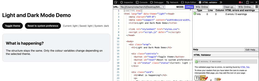
    screenshot of the theme application via data attribute on the root element

    Figure 1. Theme application via data attribute on the root element.

    In the demonstration, the theme is applied by assigning a data attribute to the root HTML element. CSS responds to this attribute by reassigning colour variables. The layout remains unchanged. Only semantic colour tokens are updated. This illustrates that dark mode is a structured variable swap rather than a visual inversion.

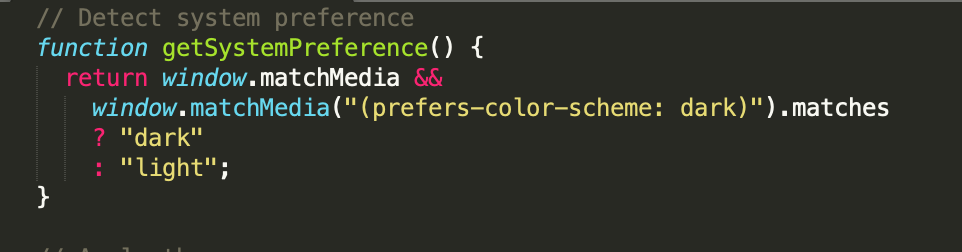
    screenshot of a javascript function using matchMedia to detect operating system colour preference

    Figure 2. Using matchMedia to detect operating system colour preference.

    The function above uses the matchMedia API to evaluate the prefers-color-scheme media query. If the operating system indicates a preference for dark mode, the function returns “dark”; otherwise it returns “light”. This enables websites to align with user-level settings without manual configuration.

    Avoiding Theme Flicker in Production

    If the theme is applied after the browser renders content, users may briefly see the incorrect theme before it switches. This flash of incorrect theme can reduce perceived quality  .

    In production environments, developers often include a minimal inline script in the head section to apply the correct theme before the first paint. This ensures that the correct colour scheme is rendered immediately.

    Performance and Energy Considerations

    Dark mode does not reduce loading time. Website performance remains dependent on file size, caching, rendering strategy and network efficiency  .

    On OLED displays, dark pixels consume less power because they are not illuminated. Therefore, battery savings are device-dependent rather than universally applicable.

    Cultural Context: Dark Mode as Trend

    Beyond technical considerations, dark mode has become culturally associated with “modern”, “developer-oriented” and “minimal” aesthetics.

    As a result, some websites adopt dark mode as a visual signal of sophistication rather than as a usability improvement. This raises an important design question: is dark mode implemented to serve users, or to signal trend awareness?

    A critical design approach requires distinguishing between genuine usability enhancement and aesthetic conformity. Ironically, dark mode can become another form of visual standardisation if adopted without contextual justification.

    Common Mistakes

    Common implementation errors include  :

    • Insufficient contrast

    • Logos disappearing on dark backgrounds

    • Form fields becoming unreadable

    • Lack of accessibility testing

    A poorly implemented dark mode can degrade usability more than not offering one at all.

    When Not to Use Dark Mode

    Dark mode is not universally appropriate  .

    Content-heavy academic sites may benefit more from positive polarity. Strong brand constraints may limit adaptability. Limited development time may result in incomplete implementation.

    Design decisions should be contextual rather than trend-driven.

    Conclusion

    Dark mode is a contextual design decision rather than an automatic improvement.

    It must prioritise accessibility, be implemented using structured design tokens, respect user preference, and be tested rigorously across themes.

    When executed thoughtfully, dark mode enhances user control and experience. When implemented superficially, it risks reducing readability and reinforcing aesthetic conformity.

    References 

    W3C. (2018). Web Content Accessibility Guidelines (WCAG) 2.1.

    https://www.w3.org/TR/WCAG21

    MDN Web Docs. prefers-color-scheme.

    https://developer.mozilla.org/en-US/docs/Web/CSS/@media/prefers-color-scheme

    MDN Web Docs. Window.matchMedia().

    https://developer.mozilla.org/en-US/docs/Web/API/Window/matchMedia

    MDN Web Docs. Web Storage API.

    https://developer.mozilla.org/en-US/docs/Web/API/Web_Storage_API

    Google Developers. (2020). Dark Mode in Web Content.

    https://web.dev/articles/prefers-color-scheme

    Nielsen Norman Group. (2020). Dark Mode vs. Light Mode: Which Is Better?

    https://www.nngroup.com/articles/dark-mode/


    View Presentation Slides

  • Designing a Small Business Website: Alf’s Cycles

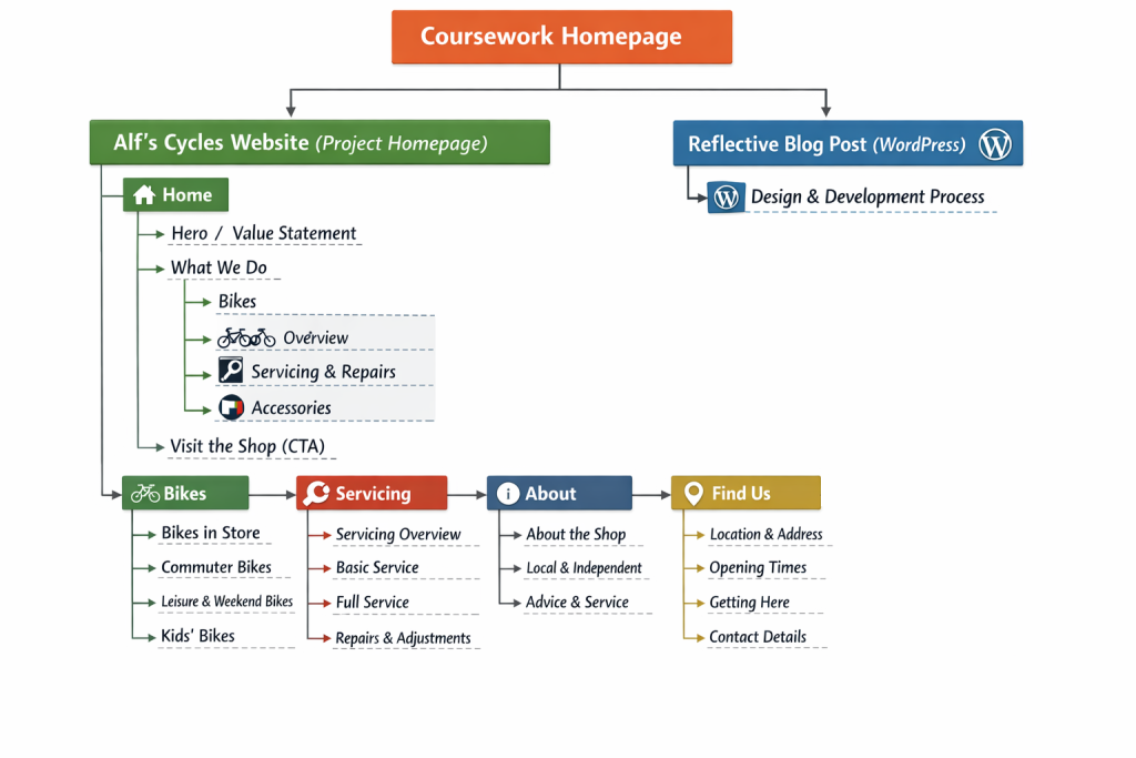
    For this project, I was commissioned to design and build a website for a fictional small, independent bicycle shop called Alf’s Cycles. The goal of the site was not to sell products online, but to act as a marketing tool that encourages people to visit the physical shop. From the start, I focused on clarity, usability, and creating a strong but simple brand identity that felt appropriate for a local high-street business.

    Before designing anything visually, I planned the content first. I identified the information a potential customer would need most: what the shop offers, where it is, when it’s open, and why it’s worth visiting in person. This content-first approach helped shape the structure of the site and ensured that important information appears early and is easy to find.

    I adopted a mobile-first approach throughout the project. I began by designing and styling the layout for small screens, then progressively enhanced it for larger viewports using min-width media queries. This helped keep the layout robust and ensured the site works well on phones, which is likely how many users will first encounter a small local business website.

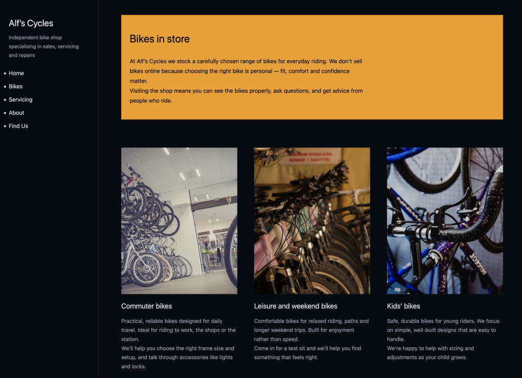
    The brand identity for Alf’s Cycles is intentionally simple and practical, reflecting the nature of a local bike shop. I chose a dark background with a strong yellow accent to create high contrast and visual impact. The yellow is used sparingly as an “editorial rule-break” across the site, appearing as full-width highlighted sections that interrupt the layout and draw attention to key content, such as page introductions. This device adds personality while remaining consistent and controlled.

    Typography was kept clean and readable, using system fonts to avoid unnecessary dependencies. I paid particular attention to spacing, line height, and heading hierarchy to ensure the content is easy to scan. Headings are clearly associated with the content they introduce, and whitespace is used to separate sections and improve readability.

    From a technical perspective, all HTML and CSS was written by hand, without frameworks or templates. I used semantic HTML elements such as <header>, <nav>, <main>, <section>, <article>, and <footer> to create a logical document structure. I minimised the use of classes and IDs, relying instead on combinator selectors and the CSS cascade. All styles are contained within a single external CSS file, which includes the Meyer reset and is clearly sectioned with comments.

    Images were sourced from free image libraries and carefully cropped and optimised. I ensured that images maintain their aspect ratio using object-fit: cover and that they do not distort across different screen sizes. Alt text was added to all images to support accessibility.

    During this project, I learned how important small layout and typographic decisions are in creating a professional result. I also gained confidence working mobile-first and relying on semantic HTML and the CSS cascade rather than excessive classes. If I were to continue developing this project, I would explore subtle micro-interactions and further refine the mobile navigation, but overall the site successfully meets the brief and provides a clear, engaging web presence for a small local business.

  • User Experience Research and Design for the WRP

    By Viola Cherchi

    Introduction

    My Major Project, The Web Rebellion Project, challenges the increasing sameness I see across modern web design. The project questions the idea of “good design” and critiques reliance on patterns, templates, frameworks, and automated tools that have normalised a predictable aesthetic. While the site itself is intentionally expressive, opinionated, and slightly chaotic, I still need a structured approach to understand how real users will experience it.

    The UX workshops with Steph and Chris showed me that even experimental websites require clarity, intention, and user awareness. Before the workshops, I was focusing almost entirely on the creative angle and the conceptual critique. After the sessions, I understood that UX is not the opposite of rebellion – it is what ensures the rebellion lands meaningfully instead of becoming noise or confusion. If my intention is to critique conformity, I need my audience to understand the critique. UX allows me to build the foundation that supports the message.

    This article outlines the UX research and design plan I will use to develop The Web Rebellion Project from Term 1 into Term 2. It explains how the methods introduced in the workshops will guide my decision-making, shape the structure of the site, and help me evaluate the experience with real users.


    1. Project Context and Goals

    The Web Rebellion Project is a digital manifesto that explores creative anarchy in web design. My aim is to question what “good design” means and to challenge the uniformity encouraged by standardised components, templated layouts, and conventional best practices. The site will feel unconventional, but its purpose is not to alienate people – it is to provoke thought, encourage reflection, and prompt designers to consider how much of their decision-making comes from genuine intent versus habit.

    Who the project is for

    One key takeaway from the workshops was the importance of defining the audience early. UX work becomes unfocused when you try to design for “everyone.” My project speaks to a specific group:

    • designers and students frustrated by formulaic, repetitive visual patterns
    • creatives who are curious about non-standard layouts and expressive design
    • people who enjoy opinionated websites and are open to disruption
    • individuals who engage well with strong conceptual direction

    These users are comfortable navigating slightly unusual interfaces, but they still expect clarity of intent. They do not need a conventional layout, but they do need to understand what the site is doing and why.

    The problem I am addressing

    Modern web design has become predictable. Many sites follow the same structure because it is safe, familiar, and easily justified through best practices. Components and frameworks make it easy to build quickly but also reinforce sameness. Designers often follow rules not because they make sense, but because they are the standard.

    The problem The Web Rebellion Project tackles is creative conformity – the loss of individuality online. From a UX perspective, this involves answering several questions:

    • What do users find frustrating about lookalike websites?
    • What does “rebellion” mean in a digital context?
    • How far can I push unconventional design without losing usability?
    • What level of disruption is meaningful rather than obstructive?

    UX methods help me understand these boundaries and guide the tone, visual choices, and structural decisions of the site.


    2. Research Objectives

    Drawing from Steph’s explanation of UX framing, I identified four key research objectives that will guide my work:

    1. Understand user attitudes toward conformity in web design.

    These insights will shape the tone and message of my manifesto and help me articulate the critique effectively.

    2. Identify how much unpredictability users find acceptable.

    Every user has a different threshold for visual or structural disruption. Understanding this helps me determine how far I can push the design.

    3. Learn how users make sense of unconventional layouts.

    This insight informs navigation design, page hierarchy, and content placement.

    4. Define what users expect from an intentionally non-standard website.

    Even when breaking norms, users still rely on certain cues. Understanding expectations helps me disrupt intentionally rather than randomly.

    These objectives provide a clear foundation for the UX methods I will use.


    3. Assumptions and Hypotheses

    Steph emphasised the importance of distinguishing assumptions from hypotheses. Identifying assumptions early prevents me from designing based on personal bias instead of user reality.

    Assumptions I currently have

    • Designers are tired of templates and want more expressive work.
    • Users can handle unconventional structure if the content is interesting.
    • My audience will understand and appreciate the rebellious tone.
    • A clear and bold manifesto will attract rather than deter my target users.

    These assumptions create direction but must be validated.

    Hypotheses I will test

    • If the site feels intentional, users will accept creative chaos.
    • If navigation is simple but visually unconventional, users will still orient themselves effectively.
    • If the manifesto is well-written and clear, users will read it even if the layout challenges expectations.
    • If users can find what they want in under 12 seconds, the site will not feel difficult or frustrating.

    Turning these into testable statements gives structure to my evaluation plan and ensures my decisions are evidence-based.


    4. UX Methods I Will Use

    The workshops introduced practical generative and evaluative methods. I selected those that align best with my project goals and audience.

    4.1 User Interviews

    I will interview 4 designers and design students. The purpose is to gather qualitative insights about:

    • how they perceive conformity in web design
    • what they consider “rebellious” or “expressive”
    • their tolerance for unconventional layouts
    • how they define a meaningful digital experience

    These interviews will help shape the manifesto, tone of voice, and the conceptual direction of the site.


    4.2 Co-Design Exercises

    Steph encouraged collaborative creative exercises to understand user expectations. I plan to run a co-design activity where participants sketch what a “rebellious website” looks like. The sketches will reveal:

    • mental models
    • what users consider essential
    • what users think can be broken
    • expectations around navigation and structure

    These insights will guide how far I can push visual experimentation.


    4.3 Empathy Mapping

    Empathy maps help break down how users think, feel, say, and do. They allow me to step outside my own perspective. I will create one empathy map per persona and attach them as PDFs. These maps will help me:

    • understand user emotional responses
    • identify potential friction points
    • anticipate misconceptions or confusion
    • support more informed design decisions

    4.4 Personas

    Personas summarise user needs and behaviours. I will create three:

    • Sara – design student seeking freedom and reassurance
    • Leo – creative director looking for meaningful disruption
    • Alex – web artist who values experimentation

    These personas will be designed and attached as PDFs.


    4.5 Journey Mapping

    Journey maps visualise how users move through the experience. For this project, I will map the following stages:

    • first impressions
    • moment of orienting
    • exploration
    • friction
    • engagement
    • takeaway

    Mapping these stages helps identify where friction is intentional and where it becomes problematic.


    4.6 Prototyping

    Chris emphasised that prototypes do not need to be polished – the aim is to test ideas, not aesthetics. I will create three prototypes:

    1. Light rebellion (structured layout, expressive content)
    2. Structured rebellion (unconventional navigation, consistent hierarchy)
    3. Full anarchy (maximum experimentation)

    These variations will help me understand the boundary between disruption and frustration.


    4.7 Usability Testing

    Even an experimental site needs to be tested with real users. I will evaluate:

    • whether users understand the purpose
    • how quickly they orient themselves
    • how they feel about visual unpredictability
    • whether they can complete essential tasks

    This is crucial for ensuring deliberate, meaningful disruption rather than unintentional confusion.


    4.8 RITE (Rapid Iterative Testing & Evaluation)

    I will apply the RITE method to make immediate changes after each test session. This prevents issues from accumulating and speeds up decision-making. It also ensures the design remains flexible and responsive to findings.


    5. Personas (Attached as PDFs)

    The user personas referenced above will be provided as separate PDF downloads. The PDFs include motivations, frustrations, goals, behaviours and accessibility considerations.

    Persona 1: Sara – The Student

    Motivated and curious, but overwhelmed by rigid rules and expectations. She needs reassurance that breaking the pattern is valid and seeks examples of expressive design.

    Persona 2: Leo – The Creative Director

    Experienced, opinionated, and tired of repetition. He needs a conceptually strong, thought-provoking site that helps him think differently.

    Persona 3: Alex – The Web Artist

    Comfortable with experimentation and drawn to expressive digital work. They want a site that feels alive rather than formulaic.


    6. Empathy Mapping (Attached as PDFs)

    The empathy maps will help me understand emotional and cognitive reactions such as:

    • “This is refreshing.”
    • “I don’t know where to click.”
    • “Finally, something different.”
    • “I need to understand the purpose quickly.”

    These insights will guide navigation choices, content hierarchy, interaction patterns, and tone of voice.


    7. User Journey Mapping (Attached as PDF)

    The journey map will track:

    • Entry – first visual impression and tone
    • Orientation – understanding what the site is about
    • Exploration – engaging with manifesto, essays, experiments
    • Reflection – interpreting the concept
    • Exit – what users take away

    Journey mapping will highlight which moments require clarity and which moments can safely invite friction.


    8. Prototyping and Testing Plan

    Prototype 1 – Light Rebellion

    Tests whether minimal disruption still conveys the message.

    Prototype 2 – Structured Rebellion

    Tests whether unconventional navigation remains navigable with consistent hierarchy.

    Prototype 3 – Full Anarchy Mode

    Tests the threshold for unpredictability and user tolerance.

    Testing Activities

    I will run:

    • moderated usability tests (5 participants)
    • first-click tests to measure orientation
    • A/B comparisons across prototype versions
    • short post-test surveys

    Metrics

    • task completion
    • time to orient
    • emotional reactions
    • confusion points
    • comprehension of the concept

    This evidence will show how users interpret intentional disruption.


    9. Evaluation and Iteration

    I will evaluate findings using:

    • behavioural observation
    • think-aloud testing
    • pattern analysis (across participants)
    • RITE method updates

    The goal is not to remove chaos but to ensure the chaos is intentional. Iteration will focus on:

    • refining navigation clarity
    • adjusting content order
    • clarifying the manifesto
    • strengthening visual hierarchy
    • balancing disruption with usability

    Testing sessions will be organised consistently. Participants will be recruited from my peer group, including design students and practicing designers who match my personas. Sessions will be conducted remotely using screen sharing, allowing participants to navigate the site while thinking aloud. Each session will last approximately 20-30 minutes, and I will record notes on navigation issues, confusion points, and emotional reactions. Feedback will be synthesised after each round to inform rapid design iterations.


    10. How UX Will Influence the Final Site

    UX supports the concept by ensuring meaning is delivered effectively. It influences:

    • how much disruption is appropriate
    • how users move through content
    • the order ideas are presented
    • the clarity of the manifesto
    • the balance between experimentation and usability
    • the emotional and cognitive impact of the experience

    Without UX research, the site could feel random or confusing. With UX research, the site becomes intentional, structured, and impactful.


    11. Accessibility & Inclusion

    Although The Web Rebellion Project challenges conventional design patterns, accessibility remains a priority. The goal is not to exclude users, but to ensure that disruption is intentional rather than obstructive. I will follow core accessibility principles by maintaining sufficient colour contrast, legible typography, and clear content hierarchy throughout the site.

    Navigation will remain consistent across pages, even when visual layouts change. Semantic HTML will be used to ensure screen readers can interpret the structure correctly. Unconventional interactions will be supported by clear textual cues, and essential content will never rely solely on visual effects.

    I will consider reduced motion preferences and avoid interactions that could cause discomfort. User testing will include accessibility checks to ensure the site remains inclusive while still expressing its conceptual intent.


    Conclusion

    The UX workshops encouraged me to think beyond pure visual rebellion and consider how people experience my work. The methods I learned – personas, empathy maps, journey mapping, co-design exercises, hypothesis testing, and iterative evaluation – provide structure to a project that could otherwise become directionless. The Web Rebellion Project aims to challenge design norms, but that challenge must be understandable and meaningful.

    This UX plan will guide my work through Term 2 and ensure the final site communicates its message effectively. It enables me to create disruption without compromising clarity and to build a site that provokes thought rather than frustration. The research and testing approach supports my intention to question conformity while still delivering a coherent user experience.