For this project, I was commissioned to design and build a website for a fictional small, independent bicycle shop called Alf’s Cycles. The goal of the site was not to sell products online, but to act as a marketing tool that encourages people to visit the physical shop. From the start, I focused on clarity, usability, and creating a strong but simple brand identity that felt appropriate for a local high-street business.
Before designing anything visually, I planned the content first. I identified the information a potential customer would need most: what the shop offers, where it is, when it’s open, and why it’s worth visiting in person. This content-first approach helped shape the structure of the site and ensured that important information appears early and is easy to find.
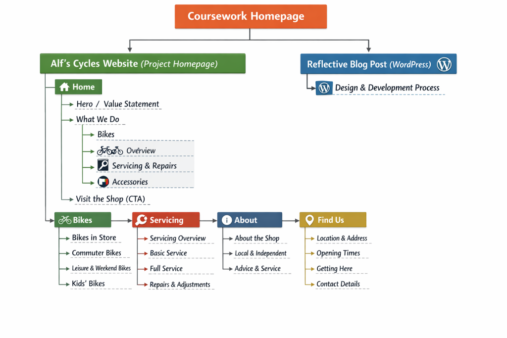
I adopted a mobile-first approach throughout the project. I began by designing and styling the layout for small screens, then progressively enhanced it for larger viewports using min-width media queries. This helped keep the layout robust and ensured the site works well on phones, which is likely how many users will first encounter a small local business website.

The brand identity for Alf’s Cycles is intentionally simple and practical, reflecting the nature of a local bike shop. I chose a dark background with a strong yellow accent to create high contrast and visual impact. The yellow is used sparingly as an “editorial rule-break” across the site, appearing as full-width highlighted sections that interrupt the layout and draw attention to key content, such as page introductions. This device adds personality while remaining consistent and controlled.
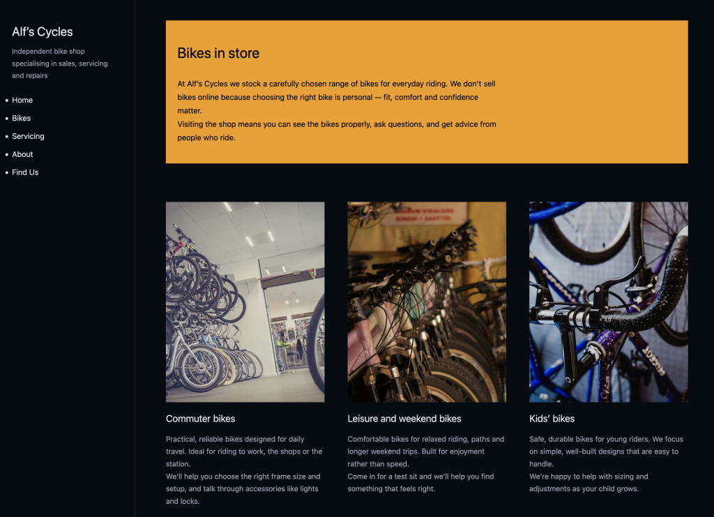
Typography was kept clean and readable, using system fonts to avoid unnecessary dependencies. I paid particular attention to spacing, line height, and heading hierarchy to ensure the content is easy to scan. Headings are clearly associated with the content they introduce, and whitespace is used to separate sections and improve readability.
From a technical perspective, all HTML and CSS was written by hand, without frameworks or templates. I used semantic HTML elements such as <header>, <nav>, <main>, <section>, <article>, and <footer> to create a logical document structure. I minimised the use of classes and IDs, relying instead on combinator selectors and the CSS cascade. All styles are contained within a single external CSS file, which includes the Meyer reset and is clearly sectioned with comments.
Images were sourced from free image libraries and carefully cropped and optimised. I ensured that images maintain their aspect ratio using object-fit: cover and that they do not distort across different screen sizes. Alt text was added to all images to support accessibility.
During this project, I learned how important small layout and typographic decisions are in creating a professional result. I also gained confidence working mobile-first and relying on semantic HTML and the CSS cascade rather than excessive classes. If I were to continue developing this project, I would explore subtle micro-interactions and further refine the mobile navigation, but overall the site successfully meets the brief and provides a clear, engaging web presence for a small local business.
Leave a Reply